Factfullness
Hans Rosling, with Ola Rosling and Anna Rosling Rönnlund:
Factfulness. Ten reasons we’re wrong about the world – and why things are better than you think
Sceptre, UK, 2018
The book Factfulness is written by Hans Rosling, together with his son Ola and Ola’s wife Anna Rosling Rönnlund. Hans Rosling was a medical doctor, who has been an adviser to the World Health Organisation and the UNICEF, and also worked within the area of medicine in developing countries, such as Mozambique. He has promoted the importance of facts for a long time, his lectures have been very popular, and his TEDtalks well watched all over the world.
The book was published in 2018 and immediately became a book that many read and many have discussed. Even me, who is not always the first one to read a new book, have read it quite a while ago.
However, I realize I keep coming back to it, so I want to write about it even if it isn’t so new anymore.
There are three reasons for it.
Firstly, the book does just what its title promises, it shows the glory of facts. It shows that facts are available about almost anything. More importantly, it shows how often we believe something (collectively) that is far from the truth. There are many reasons for this, like what is shown to us on media. The book also shows that we as human beings have a preference of drama. For politicians or anyone presenting a topic it is always tempting to show the issue with a sense of this drama; maybe exaggerating a little, maybe not showing all the facts available etc. This all leads to an over dramatical worldview. The book reminds us that we should always remember to check the facts (from a credible source), and not just assume based on what we think are facts. This is something to cherish within the current political climate.
The book proves this point by the “ape-test”. During the process the authors have asked a total of 12000 people to test their knowledge about the world today. The questions are of the kind: “Where does the majority of the world population live?” and there is always an option a) b) and c). Many of these people who responded have been very well educated, and experts in many fields. Still, most of the people fail to get the answers right. Instead, we have a tendency of being overly pessimistic. The comparison is the “ape-test”; if you would ask a bunch of apes to just press the buttons for the options of a) b) and c), they would just press any arbitrary buttons. This is total guessing, with no prior prejudice, and gives a good comparison. All the groups that the authors approached guessed worse than these fictive apes, i.e. the results were worse than just the statistical average. Maybe education and expertise, “knowing” things, doesn’t make us better at checking our facts, but rather the contrary…
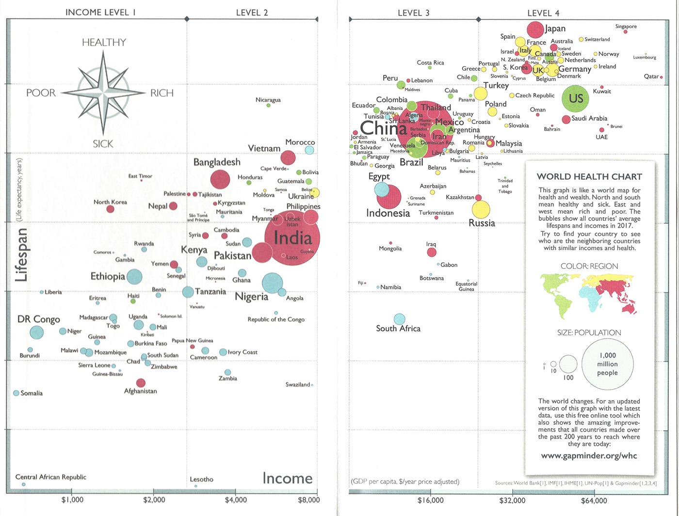
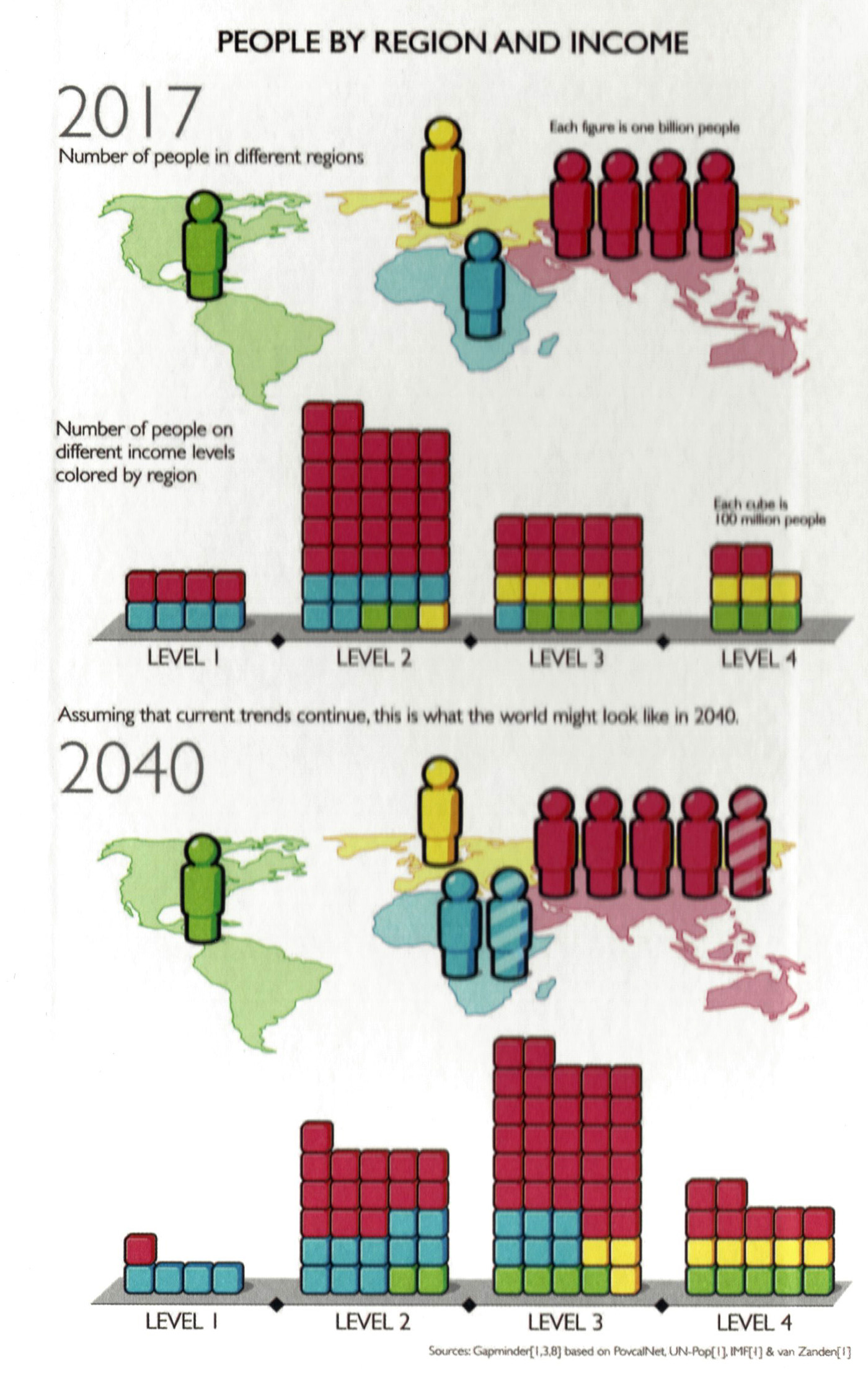
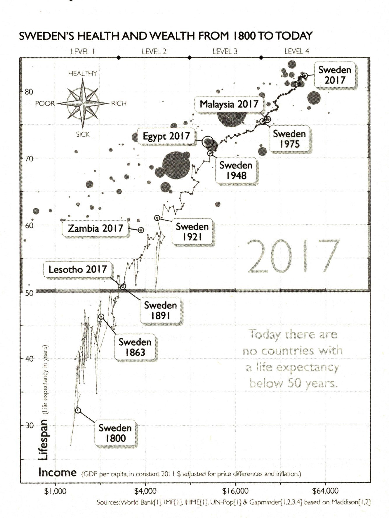
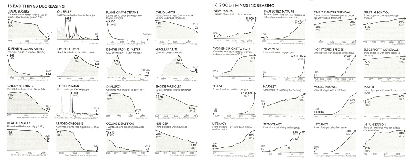
Secondly, the book brings hope. So many of these facts prove, that the world is in way better shape than we think. Children get educated, and countries develop. Rosling shows that although Sweden is now one of the world’s richest and healthiest countries, if we compare the Sweden he was born in, the year 1948, it is very similar to the level of health and wealth of Egypt today. “I was born in Egypt” Rosling says, as he shows a baffling development of how all countries of the world have developed. He also shows how much many bad things, like children dying or HIV-infections, have decresed, and how many good things, like democracy or girls in schools, have increased.
The third reason why I want to lift this book, is the one I have been coming back to most lately. This book is a wonderful example of collaboration across fields, and the importance of great information design. Ola Rosling has been a wizard in digging and analyzing the data, and developing tools to do this. Anna Rosling Rönnlund, with a design twist, has developed new ways of presenting the data and making it understandable for the end user. I have had the joy of hearing her talk about the development process. If we wouldn’t have great information design, we might miss Roslings points.
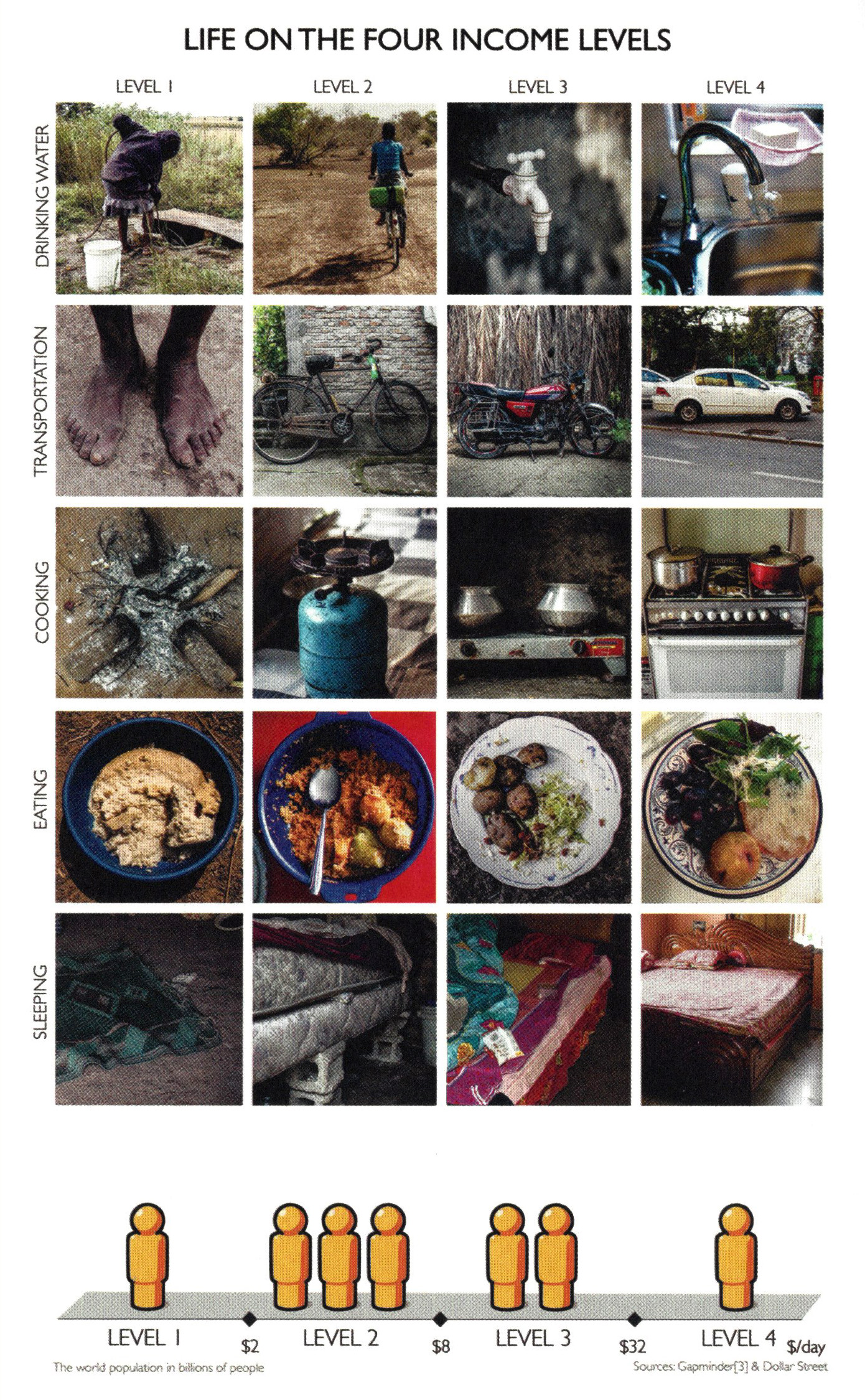
Many of the big picture overviews are sort of bubble graphs, showing distribution through colour, size and position of these “bubbles”. The animated bubble graph is a result of a software called Trendalyzer, which was acquired by Google in 2007. In addition, there are great photographs, showing in a very simple way how some of our daily commodities are different (and similar) depending on our income level. On level 1 the most common form of transport is to walk by foot, on level 2 we can afford a bike, on level 3 a motorcycle and 4 a car. More of these pictures are also available within the project called Dollar street on the www.gapminder.org-site. These kind of analyses of potential end-users or customers are also done within larger, consumer-oriented companies, but usually those companies do not share how they do it or the methodology behind the work, as it is considered very strategic and confidential. The Gapminder model is an excellent way to do this work, and can serve both as an inspiration and as a tool to many organisations. If we want to solve the world’s most pressing problems, we need to know what, for whom, and why we are trying to solve.
With the joined efforts of a great idea, good facts and a brilliant way to show them, this book becomes a pleasure to read. I warmly recommend it to anyone who wants to understand where the world is going, to get hope and inspiration, and to do something about changing it!