Information Design
Juuso Koponen and Jonatan Hildén: Data Visualization Handbook.
Aalto University publication series, Aalto ARTS Books, Finland, 2019
During these weeks of the covid-19 virus raging around we have all been staring at different graphs and charts, trying to understand what is happening in the world around us.
One of the very first graphs to get attention during the virus outbrake was about “flattening the curve”. It described in a very comprehensive way why it was important to act immediately, with limitations on how people are allowed to move, and introducing social distancing. The original graphics was done by visual-data journalist Rosamund Pearce for the Economist, based on a Centers for Disease Control and Prevention (CDC) paper.
It was very simple, and just showed that by introducing social distancing measures we could delay the epidemic and reduce the height of the epidemic peak. By the time the same graph was shown in the New York Times, a new line, showing the healthcare system capacity, had been introduced.
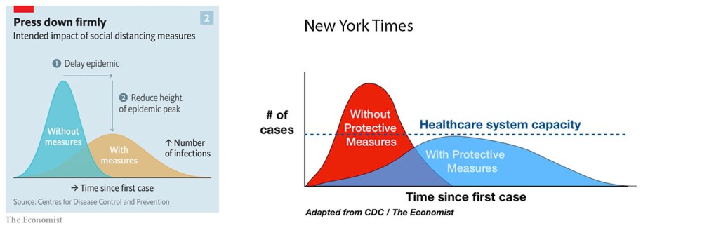
With the healthcare capacity line included, the aim was to show the public that our healthcare system is overburdened, and that if we don’t take the measures needed, more people will die. What is interesting is that none of these graphs have any scale or numbers of cases on the y-axis. This means that we can’t read the chart for how many cases the healthcare system would be able to tackle, or how many cases might be at the peak of each of the curves. Soon after the posts with the curve went viral it became obvious that the principal of the charts apply, but that the situation was far more dire than what the original curve suggested. New charts started to appear with the line for the healthcare system capacity being lower and lower…
Despite this, the “flatten the curve” graphics in all its variations have been circulating and redrawn ever since. It is a good proof of how powerful information design can be. The scientific papers in themselves did not move us, they did not make us (or politicians) take action, and they did not necessarily make us consider the different alternatives we have ahead of us. It is only when we are able to make those numbers and scientific articles relevant to us, put them in context and visualise what they might really mean, when people more broadly start taking action.
Some, very rare people who are deep into the issues might be able to visualize this contextualisation in their heads from looking at the numbers from the scientific papers alone, but for the very large majority of our population – we need someone to show us what the numbers actually mean. And this is the reason we need information design so much now.
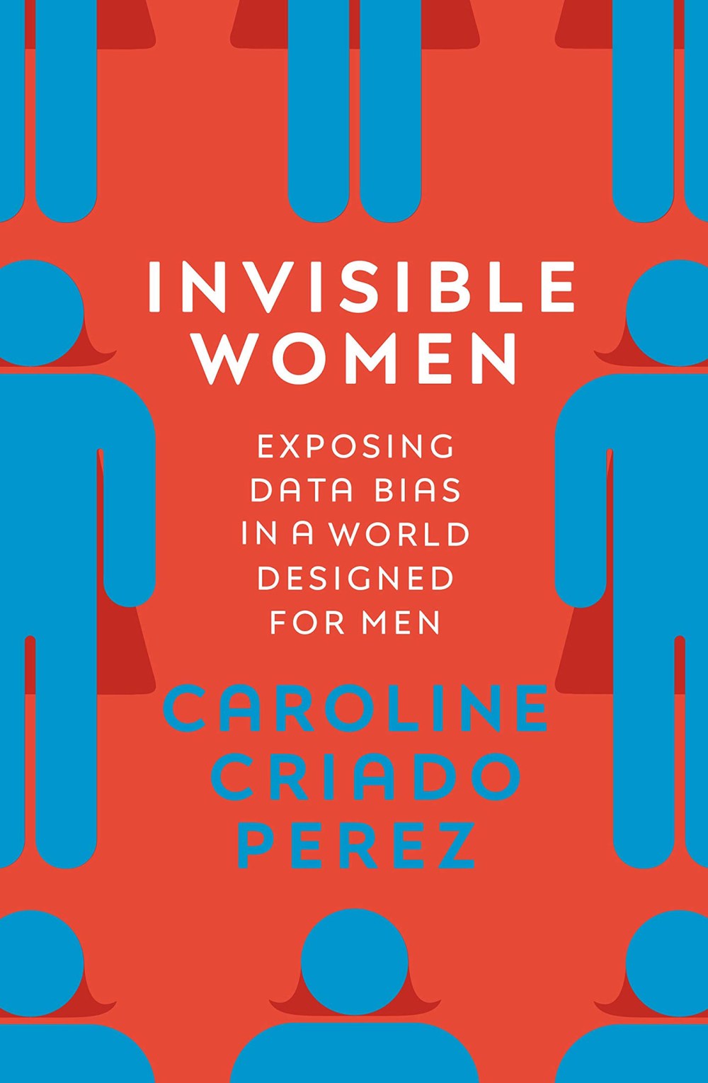
Of course, the data could be wrong or skewed. Today, there are still many open questions about the covid19-virus, and hence the information can be wrong or biased in itself. Or if it is correct, then different sources might want to present data in a particular way, and have a bias. There has been a lot of discussion on how biased data has become in our world today, even prior to the covid19-crises. One of these discussions has circled around how gender biased our data, or the algorithms built to collect the data, can be. If you are interested in this aspect, I warmly recommend you to read Invisible women: Exposing Data Bias in a World Designed for Men by Caroline Criado Perez.
But if we for a while assume that the data we have is accurate, what can we then get out of it in the midst of a crisis? If there is one thing that has been the same all around the globe during this time, it is that we are all trying to understand what is happening around us. Changes are happening at an un-precedented speed, and in an area in which very few of us are specialised (although plenty of “twitter-virologists” have appeared lately…..).
The interesting thing is, that most of the visualisations we are staring ourselves blind on are actually based on the same data, pulled together by the John Hopkins Institute’s Coronavirus Resource Center.
So when we are all using the same input data it is what we can make out of the data that matters.
We now have students doing 3D-animations (one of my favourites is covidvisualizer.com, by two students from Carnegie Mellon University) and large newspapers like Financial Times opening their graphics for everyone. The ability to produce compelling information design becomes a true asset for newspapers, and these visualisations are also attracting new readers to their sites.
This of course applies to any organisation – how well you put forward your thoughts now probably affects how well your message reaches home.
So the current situation has made it obvious that we need good information design. If you aren’t too familiar with the field, I warmly recommend the book “Data Visualization Handbook” written by Juuso Koponen and Jonatan Hildén, and published by Aalto ARTS Books in 2019. It is an excellent introduction into this topic, with plenty of intriguing examples from all around the world.
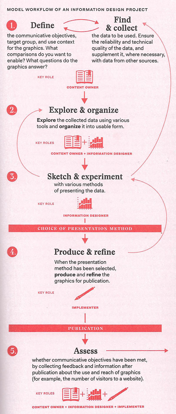
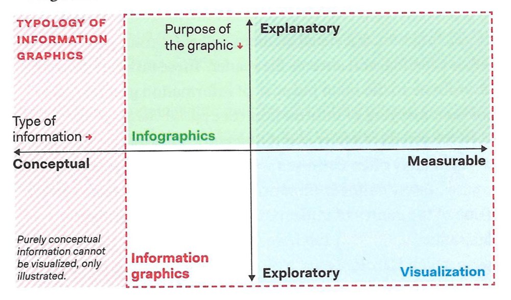
In the book they define Information design being about presenting information in the clearest way possible. Information can of course come in many forms, and be visualized in many ways. In the book they divide between explanatory graphics (for example explaining how many people have died of a virus) and exploratory graphics (for example telling the story of what might happen if we do a or b and why it is important)
The Data Visualization Handbook starts with an introduction to the topic with a historical overview, and then gives us some theory about visual perception. What affects what we see?
There are many general principles of visualization design that we can use to affect what it is that we see. When you have data, how should you present it? Part of this discussion is on what kind of narrative structures, layouts or charts we could use. But equally important is to understand how we organise and categorise our data.
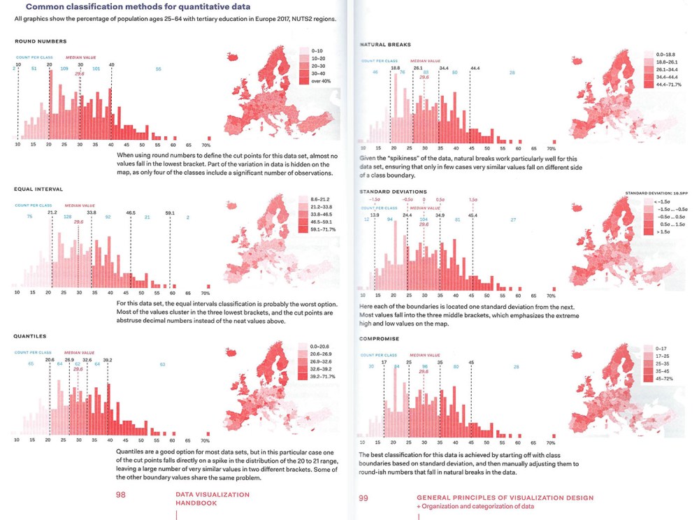
This relates very much to the data shown around the covid-19. Of the charts that have been used to show covid-19 related deaths most have been using a logarithmic scale on the vertical axis. On a linear scale the distance between numbers is equal, so the distance between three and four is the same as between seven and eight. In a logarithmic scale the values increase exponentially.
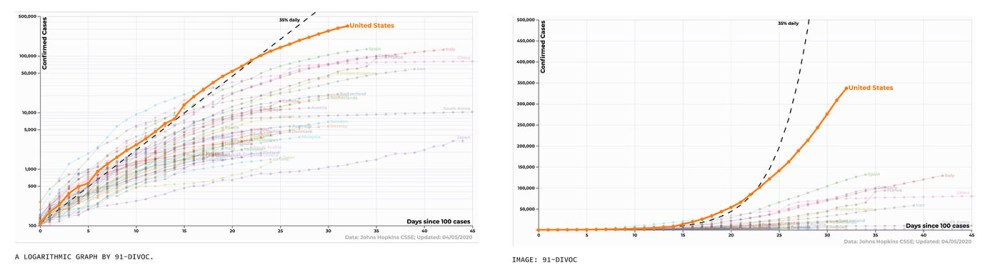
Turns out people aren’t that used to reading charts or other data visualisations, and in addition, it is often difficult to find what data has been used and what left out. This week I heard someone commenting that China was still “ahead”, looking at this curve to the left. We had a discussion about what “ahead” meant – as the view to how far further right the country was only meant that it was more weeks since the outbreak. We also talked about how this chart only looked at how many had caught the virus, not recovered from it, and hence it doesn’t show that there at the moment are far fewer cases in those countries that have had the virus for a long time. (Because the virus only lasts for a limited time in each individual, and then they are either cured or dead, but don’t have the virus any more). The tiny difference in how high the orange curve goes in the chart to the left, actually means that the US now has a lot more cases than China ever had, which might be easier to understand from the linear chart to the right.
So how we present data really matters – both from the point of what we want to tell with it and what the audience is able to understand from it.
The book then continues with looking at different information design genres: information illustrations, maps, statistical graphics, concept graphics, network diagrams, and scientific diagrams.
As we have talked so much about scientific visualizations, (understanding the virus) I will focus more on one of my eternal personal loves: maps.
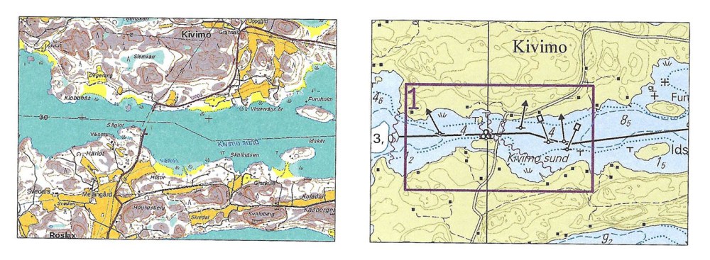
Maps have many different forms; there are topographic maps, road maps, guide maps, nautical maps and many more. What’s common to all of these is that they are a means of wayshowing.
We use a map to know which underground or subway line to take, we use a map to show the way of how a company’s product portfolio is going to develop, and we use a map to avoid hitting a rock when we sail. Maps of some kind have been created in most cultures around the world.
A map does not accurately represent reality as it is. Map design includes a large number of choices, from collecting, processing and aggregating data to selecting the method of presentation, as well as the colours, symbols and text styles used. These choices always entail compromises between the content and the specific necessities of visual representation.
So how we project the world around us heavily affects what kind of world-view we get. In our current geographical maps, we often use the Mercator projection, which makes the Nordics look bigger and Africa smaller than what they actually are.
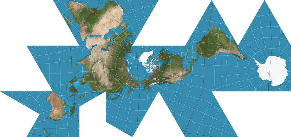
To me, maps also concretize what we actually know about the world around us in each moment of time, and how we perceive it. There was a time when we thought that the world was flat, and it was represented as such. When the concept of the “globe” was born, and we understood that the earth was rotating around the sun and not vice-versa, our representations changed, even if we still knew very little of the different continents and their sizes, and in today’s worldview “misrepresented” the shapes of seas and landmasses.
Lately, different network diagraphs have been largely used, and they are also given a chapter of their own in Koponen&Hildén’s book.
Now the pandemic is again changing how we view the world. Distances are both increasing and decreasing. It is just as easy to have a meeting with a colleague on the other side of the earth as it is with someone who is self-isolating only a block away from you. What kind of new world-maps will this create? The current maps focus on physical contact, showing cities and other urban congestions, but what about the future? What would we need for way finding in these times? Times of crisis have always always been times of great imagination, so I am eagerly looking forward to what kind of worldview-projections will come out of this. Maybe some new hybrid combining ideas of both network digraphs and physical representations? Who knows….
At the moment organisations all around the world are hiring professionals for better information design at an increasing pace. “Everyone” wants their viewpoint to be better understood and their story more engaging. Universities in most countries are starting or growing their programs in Information Design and Data Visualization, many in relation to all the new possibilities large datasets and AI-based algorithms are bringing us.
Despite all of this, I think the current crisis has showed the importance of knowing at least something about information design to all of us. So if this isn’t your field of expertise I warmly suggest that you indulge into the topic at least a little. It might just take you on a mind-boggling tour of everything this world can and cannot be. For this trip I think the Data Visualization Handbook is an excellent choice. I warmly recommend it, and hope that you enjoy the ride!